今天难得休闲,决定玩一下CSS3的动画特性,写了一个HTML+CSS3的复古时钟。
来看看最终成品:
See the Pen Dynamic Clock by liuyanghejerry (@liuyanghejerry) on CodePen.
要实现本文的时钟,需要用到许多CSS3中的高级特性,比如animation steps,keyframe、transform等。在跟随教程之前,请先确保您的浏览器支持这些特性。
HTML结构
时钟的HTML结构非常简单:
没有用任何高级的东西,都很平常。
一个静止的钟
.clock {
  height: 400px;
  width: 220px;
  margin: 0 auto;
}
.clock .body-top {
  height: 200px;
  margin: 0;
  padding: 0;
  border-radius: 400px 400px 0 0;
  background-color: #B28247;
}
.body-top .dial {
  height: 150px;
  width: 150px;
  margin: 0 auto;
  position: relative;
  -webkit-transform: translateY(30px);
  transform: translateY(30px);
  border-radius: 200px;
  background-color: #C9BC9C;
}
.dial .second-hand {
  height: 74px;
  width: 10px;
  border-radius: 20px;
  position: absolute;
  z-index: 2;
  -webkit-transform: translate(70px, 75px) rotate(180deg);
  transform: translate(70px, 75px) rotate(180deg);
  -webkit-transform-origin: 50% 5px;
  transform-origin: 50% 5px;
  background-color: #7F4F21;
}
.dial .minute-hand {
  height: 70px;
  width: 10px;
  border-radius: 20px;
  position: absolute;
  z-index: 3;
  -webkit-transform: translate(70px, 75px) rotate(180deg);
  transform: translate(70px, 75px) rotate(180deg);
  -webkit-transform-origin: 50% 5px;
  transform-origin: 50% 5px;
  background-color: #40220F;
}
.dial .hour-hand {
  height: 50px;
  width: 10px;
  border-radius: 20px;
  position: absolute;
  z-index: 4;
  -webkit-transform: translate(70px, 75px) rotate(180deg);
  transform: translate(70px, 75px) rotate(180deg);
  -webkit-transform-origin: 50% 5px;
  transform-origin: 50% 5px;
  background-color: black;
}
.clock .body-bottom {
  position: relative;
  z-index: -1;
  height: 190px;
  margin: 0;
  padding: 0;
  border-radius: 0 0 20px 20px;
  background-color: #7F4F21;
}
.body-bottom .pendulum {
  height: 140px;
}
.pendulum .pendulum-stick {
  height: 70%;
  width: 12px;
  margin: 0 auto;
  background-color: black;
}
.pendulum .pendulum-body {
  height: 40px;
  width: 40px;
  border-radius: 40px;
  margin: 0 auto;
  margin-top: -2px;
  background-color: #40220F;
}
一个静态的钟不难,利用`transform`(或者`top`、`left`),我们可以将时针、分针以及秒针都摆放在同一个圆心上。注意`z-index`的顺序,因为我们希望最长的指针是在最下面的,这样才能确保指针重合的时候,比如0点0分0秒,短指针不会被完全覆盖。
`.pendulum-body`中,我把`margin-top`向上偏移了一点,这样钟摆才不会脱离那根棍子(唔……)。
另外,我给三根指针都设置了`transform-origin: 50% 5px;`(好吧,写在一个单独抽象的class里也行,我就是懒的改了),这是为了保证旋转、偏移的圆心始终是指针的端点中心,如图所示:
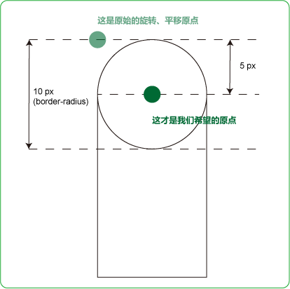
原点偏移示意
不过请忽略我给`border-radius`写成20px,我就是以防万一……
See the Pen Static Clock by liuyanghejerry (@liuyanghejerry) on CodePen.
让钟动起来
指针
时钟指针的动画可以通过旋转来完成。CSS3的`steps()`非常好用,通过它可以把一段时间分成N等份来播放动画。比如对于秒针,秒针旋转一圈理论上应该是60秒,在这段动画里,我把旋转一圈的时间恰好等分成60份,这样每秒秒针都可以转动一次。相应地,分针、时针也按各自的旋转周期来划分。
我这儿只让秒针1秒动一次,但是实际上你可以把60秒切割成更细的粒度,比如3600份,这样秒针就看起来连续转动起来(而不是离散地)。
下面是改动后的代码:
.dial .second-hand {
  height: 74px;
  width: 10px;
  border-radius: 20px;
  position: absolute;
  z-index: 2;
  -webkit-transform-origin: 50% 5px;
  transform-origin: 50% 5px;
  animation: timehand 60s steps(60, end) infinite;
  -webkit-animation: timehand 60s steps(60, end) infinite;
  background-color: #7F4F21;
}
.dial .minute-hand {
  height: 70px;
  width: 10px;
  border-radius: 20px;
  position: absolute;
  z-index: 3;
  -webkit-transform-origin: 50% 5px;
  transform-origin: 50% 5px;
  animation: timehand 3600s steps(3600, end) infinite;
  -webkit-animation: timehand 3600s steps(3600, end) infinite;
  background-color: #40220F;
}
.dial .hour-hand {
  height: 50px;
  width: 10px;
  border-radius: 20px;
  position: absolute;
  z-index: 4;
  -webkit-transform-origin: 50% 5px;
  transform-origin: 50% 5px;
  animation: timehand 43200s steps(43200, end) infinite;
  -webkit-animation: timehand 43200s steps(43200, end) infinite;
  background-color: black;
}
@keyframes timehand {
  0% {
    -webkit-transform: translate(70px, 75px) rotate(180deg);
    transform: translate(70px, 75px) rotate(180deg);
  }
  100% {
    -webkit-transform: translate(70px, 75px) rotate(539deg);
    transform: translate(70px, 75px) rotate(539deg);
  }
}
@-webkit-keyframes timehand {
  0% {
    -webkit-transform: translate(70px, 75px) rotate(180deg);
    transform: translate(70px, 75px) rotate(180deg);
  }
  100% {
    -webkit-transform: translate(70px, 75px) rotate(539deg);
    transform: translate(70px, 75px) rotate(539deg);
  }
}
钟摆
我没找到特别好的方法来真正实现单摆运动,所以只用了普通的贝塞尔曲线进行模拟,基本上可以说是凑合出来的。
.body-bottom .pendulum {
  height: 140px;
  -webkit-animation-duration: 2s;
  animation-duration: 2s;
  -webkit-animation-name: ticktock;
  animation-name: ticktock;
  -webkit-animation-iteration-count: infinite;
  animation-iteration-count: infinite;
  -webkit-animation-timing-function: cubic-bezier(0.645, 0.045, 0.355, 1.000);
  animation-timing-function: cubic-bezier(0.645, 0.045, 0.355, 1.000);
  -webkit-animation-direction: alternate;
  animation-direction: alternate;
  -webkit-animation-fill-mode: both;
  animation-fill-mode: both;
  -webkit-animation-play-state: running;
  animation-play-state: running;
  -webkit-transform-origin: 50% -70%;
  transform-origin: 50% -70%;
}
我还写了一份SCSS的,仅供参考。
这里有点细节,旋转的原点需要向上偏移一些(`transform-origin: 50% -70%;`),超出画出的钟摆的范畴,这样钟摆看起来才更加真实。
最终结果
See the Pen Dynamic Clock by liuyanghejerry (@liuyanghejerry) on CodePen.
好了,一个有钟摆、指针按照真实世界来动的复古时钟做好了。但是这个钟还有一些瑕疵:
1、钟摆看起来不是特别自然,因为不是真正的单摆运动曲线。如果谁有什么更好的办法,记得告诉我;
2、时间总是从0开始,这个不太好,如果是实时的就好了。但我真的不想加JS进去。